Noviera is built to make fundamental equity analysis easier to read, easier to visualize, and easier to connect directly to stock price and underlying business value through our global markets coverage. We also aim to do this while being as transparent and educational as possible.
Each output file is built around four core sections, plus a bonus section:
The goal is not to overwhelm users with every possible metric. The goal is to show the variables that matter most, explain how they connect to the stock price, and help users understand whether the current valuation looks discounted, fair, or overpriced. We present our output as either a green favorable signal, an orange neutral signal, or a red cautionary signal.
1. How to Read the Chart
The Noviera chart is the core visual output of the platform.
It shows the stock price over time, then overlays selected fundamental valuation ranges on top of that price history. These ranges represent the multiples a stock has typically traded within, which helps users see how the market has historically valued the company relative to its own fundamentals.
Instead of looking at price in isolation, the chart asks a more useful question:
Where is the stock trading today relative to the company's earnings, cash flow, book value, and historical valuation range?
This makes the chart different from a typical technical analysis chart. Its reference points are driven by financial statements rather than moving averages, trend lines, or momentum indicators alone.
What the Valuation Multiple Range Lines Represent
The chart can display valuation ranges based on selected fundamentals.
The key variables we visualize are:
- Price to Earnings
- Price to Free Cash Flow
- Price to Book Value
- Enterprise Value to EBITDA
Each overlay takes a core financial statement variable and applies a valuation multiple to it.
For example, earnings come from the income statement, free cash flow comes from the cash flow statement, and book value comes from shareholder equity on the balance sheet. EV to EBITDA combines a valuation measure of the entire business with EBITDA, which is commonly used to compare companies with different debt levels and capital structures.
In simple terms, the chart shows:
If the market values this company at a low, average, or high multiple of its fundamentals, where would the stock price sit?
How to Interpret the Valuation Multiple Ranges
The valuation bands are intended to act like fundamental price zones.
When the stock is near the lower part of a valuation range, it may suggest that the market is assigning a lower multiple to the company's fundamentals than it has in the past. That can indicate that the stock is becoming more discounted, assuming the underlying fundamentals remain stable or continue improving.
Seeing the range itself grow or erode over time is also a useful signal. It helps show whether earnings, free cash flow, book value, or EBITDA are improving as the stock price evolves and reaches new highs or lows.
When the stock is near the middle of the range, it may suggest that the current price is closer to its historical fair-value range.
When the stock is near the upper part of the range, or above it, it may suggest that the stock price is moving faster than the company's financial position. In other words, the stock may be trading at an extended valuation and may be more vulnerable to settling back into the valuation ranges it typically trades within.
New highs and lows that develop in line with the company's balance sheet strength, earnings power, and free cash flow generation can be more meaningful than price moves that occur without fundamental support. When the financials support the price level, the valuation range can help give confidence that a recent high or low may be justified.
The key idea is simple:
The chart helps users see whether price is moving with fundamentals, ahead of fundamentals, or below fundamentals.
Reading Price Position in the Ranges
A stock trading near the bottom of its historical valuation range is not automatically a buy.
It may be discounted for a reason. Earnings may be weakening, margins may be compressing, debt may be rising, or the market may be correctly pricing in deterioration in the business.
Likewise, a stock trading near the top of its valuation range is not automatically a sell.
High-quality companies can remain expensive for long periods, especially when they have strong growth, high margins, high returns on invested capital, recurring revenue, or durable competitive advantages.
A helpful way to read the chart is:
| Price Position | Possible Interpretation |
|---|---|
| Near lower end of its range | May indicate a discounted valuation, especially if the long-term ranges have also been trending upward and signaling intrinsic growth. |
| Near middle of its range | Price may be close to its historical fair-value range, indicating a more neutral valuation signal. |
| Near upper end of its range | May indicate caution, since price may not have much more headroom until fundamentals move higher as well. |
| Above upper end of its range | May indicate that price is outpacing the company's financial position unless near-term earnings growth is strong enough to justify a higher valuation range, or unless the sector is experiencing a broader valuation shift. Our signal system is designed to account for explosive growth when it is present in the forward range. |
| Below lower end of its range | May indicate a meaningful discount, as long as the fundamentals are not eroding in a way that justifies the lower price. |
The chart and signal system are aimed at spotting when a stock is trading near a historically cheap or expensive valuation range, and identifying when a stock may be returning to a more normal valuation zone.
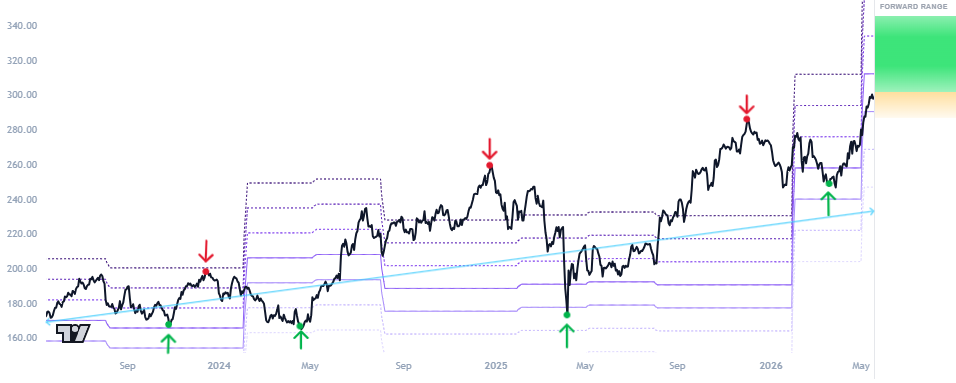
2. Forward Range
The forward range is designed to make it even simpler for users to interpret what the fundamental price chart is telling them about the stock price in relation to its valuation history. It helps show users how we would interpret the chart if we were looking at it and making a judgement call based on the valuation levels. We apply weighting to the key visualised fundamental variables, as well as to additional factors from the table that are not displayed directly on the chart, to derive our forward range estimate.
The purpose is to answer: if the company is at the lower or upper end of a valuation band, what price zones become more or less plausible?
The forward range becomes even more useful when several signals line up.
For example, if free cash flow is growing, margins are stable, debt is manageable, and the stock is trading near the lower part of its own historical free cash flow valuation range, the forward range may show a more constructive setup.
On the other hand, if the stock is trading near the upper end of its historical multiple range while earnings growth is slowing and free cash flow is weakening, the forward range may show a more cautious setup.
The forward range presents three scenario areas:
| Range Area | How to Read It |
|---|---|
| Green: most likely range | Our core expected range based on the current valuation setup, multiple estimates, and financial trend signals. |
| Orange: less likely but plausible range | A plausible extension range where the price may move if momentum or fundamentals shift more quickly than expected. Our signal system updates weekly, so recommendations may change before price reaches this area. |
| Red: lowest likelihood outcomes | A possible but lower-confidence area where price may travel, but where the move appears less likely over the medium term before more data is available for assessment. |
A favourable signal will usually show a forward range with a clear upside direction.
A cautionary signal will usually show a forward range with a clear downside direction.
A neutral signal is not a decisive bullish or bearish call. It means the system does not see a strong enough valuation setup to suggest that the stock should move meaningfully in either direction from where it currently sits within its valuation range. In a neutral setup, the forward green estimate range can still vary in how it is distributed around the current price. A firm neutral signal will usually show a range that is spread more evenly between upside and downside, suggesting that both directions are viewed as relatively balanced.
A neutral signal can also result in a forward range which leans slightly favorable or slightly cautionary. This adds more detail to the system's view of the next likely area of movement, while still keeping the overall recommendation neutral. In this sense, a neutral signal can be read in three ways: outright neutral, neutral but slightly weighted to the upside, or neutral but slightly weighted to the downside.

3. How to Read the Fundamental Factors Table
The Fundamental Factors Table is the second major section of the output file.
While the chart shows valuation visually, the table shows additional financial variables that help explain our signal evaluation.
It is designed to highlight a curated set of high-impact factors across the financial statements that we have determined to be highly relevant. We revisit these factors periodically and also show their growth rates over the last three-year window.
The table is intentionally selective. We do not try to show every possible accounting line item.
Instead, the table follows an intuitive ordering of key factors, similar to the way a user may read through the financial statements. It moves from income statement variables such as revenue, EBITDA, and earnings, to balance sheet variables such as debt, equity, and ending cash, then to cash flow variables such as capital expenditures and free cash flow.
For variables that are presented as full numbers, we also display their growth rates over 1-, 2-, and 3-year periods. For variables that are presented as percentages, we display the prior 1-, 2-, and 3-year levels of the variables for easy comparison, without needing to go through multiple years of financial filings by hand.
On the left-hand side of the table, you may notice an indication near a factor's name signaling that it was highly valuable to the signal system when coming to its conclusion on its price recommendation.
Why We Keep the Table Lean
We use empirical testing on these factors to identify which financial variables and growth rates tend to have the strongest relationship with valuation, price behavior, and forward-looking equity signals. That is why the table emphasizes selected variables instead of overwhelming users with a full financial statement dump.
The goal is to strip away lower-signal information and focus on the factors most likely to matter, making users' learning of key financial variables and decision-making ability on investment choices faster.
Over time, these factors may be updated as market behavior changes, sector relationships shift, or new evidence improves the model. The table is designed to stay lean, relevant, and adaptable.
4. Signal Recommendation
All of these elements, the valuation chart, the forward range, and the fundamental factors table, feed into our signal system. The signal is the summary output of everything the system is observing across the valuation setup and key financial variables.
You will find the signal in the lower right of the chart. It may be updated as often as weekly, subject to material developments in the company's financial position, valuation, or broader market context.
Each signal carries a specific meaning:
Our system expects appreciation in price over the medium term.
Our system expects the stock to remain within a similar valuation range.
Our system expects a potential decline in price over the medium term.
Because Noviera is built for long-term investors, the signal represents a price move that may occur over a medium-term window of roughly six months or so. It reflects where our system believes the stock is positioned relative to its own valuation history and fundamental trajectory.
5. Written Analysis
The written analysis is one of the highest-impact sections of the platform.
This is where we translate the chart, the forward range, and the fundamental factors table into a structured research-style interpretation. The purpose is to share the framing, context, and experience of how institutional-grade research reports telegraph information to their readers.
The written section has been curated from input by professionals with experience across equity research, credit research, consulting, and major financial institutions. That experience is reflected in the rigorously defined templating and structure of our report. The goal is to consistently output a precise written style that maintains its institutional quality, while using AI tools to speed up and massively reduce the cost hurdles of sharing this level of detail and structure with everyday investors and students of finance.
What the Written Analysis Covers
The written analysis is intentionally structured so that users can move from the charts, signal, and fundamental factors into the business and market developments to complete the full fundamental analysis process and give you the confidence that you are well informed by our platform to make investment choices that protect your capital and work to grow it systematically.
The written section aims to be a comprehensive capture of all matters that are currently affecting a company. The most common topics, subject to their relevance, are typically the following areas:
This section explains the valuation signal, including whether the stock appears discounted, fairly valued, or expensive relative to its own historical valuation ranges. It also explains which valuation multiples appear most useful for the company and how the forward range should be interpreted.
This section explains what the company does, how it makes money, the scale of the business, and any recent business developments that may be relevant to the valuation.
This section discusses the company's competitive position, business mix, geographic exposure, customer concentration, product diversification, and other factors that may affect the durability of its earnings and cash flows.
This section highlights regulatory, legal, policy, or legislative developments that may affect the company's operating environment, financial outlook, or financial measures.
This section discusses major acquisitions, divestitures, strategic investments, capital projects, or other large investing activities that may affect growth, leverage, cash flow, or business risk.
This section reviews recent insider buying or selling activity where available. Insider activity is not a perfect signal by itself, but it can provide useful context when viewed alongside valuation, business performance, and market sentiment.
This section considers recent analyst rating changes, price target changes, or changes in market sentiment from equity research analysts where available. These are not treated as the final answer, but they help show how the broader market is interpreting the company.
This section considers recent corporate credit ratings, outlook changes, or debt-related developments where available. This is especially useful for understanding leverage, refinancing risk, financial flexibility, and balance sheet strength.
This section reviews recent capital allocation decisions, including new share issuance, repurchase programs, dividend changes, and planned capital expenditures. These items matter because they can affect dilution, shareholder returns, free cash flow, leverage, and the company's ability to fund growth.
This structure is meant to be all-inclusive without becoming overwhelming. It gives users a complete view of the company, while keeping the analysis focused on the factors most likely to affect its price today.
6. Report Regenerations and Data Feeds
The output file is a living page. The charts, tables, and other financial data are updated daily, and stock price data is live-fed, meaning users can keep the same output file open throughout the day and watch how prices are moving throughout the day. The written analysis and signal recommendation are designed to help users make a decision defensibly, so these intuitively do not update daily. The written portions are subject to human review on an ongoing basis, and may reflect those updates at any time. However, a full regeneration of the written analysis is typically performed on about a weekly basis. If something high impact arises for a company that a human reviewer identifies, it may be regenerated sooner.
7. (Bonus Section) How to Read the DCF Sampler
The Discounted Cash Flow (DCF) sampler is designed as a learning tool for the conceptual rigor behind classical financial valuation.
Our signal system remains the dominant analytical output because it is grounded in analysis of the fundamental variables we highlight and their historical relationship with stock price behavior. This ultimately allows us to assign a recommendation and forward-looking price range with greater confidence than relying on manually selected DCF assumptions alone. The DCF is still useful, but more as a supporting tool that helps users understand what assumptions may already be embedded in the current market price.
It helps users understand how a company's value can change based on different assumptions about future free cash flow, growth, discount rates, and terminal value. This is useful because DCF analysis is one of the valuation methods used in corporate finance, investment banking, equity research, and other professional valuation settings when assumptions are developed analytically, subjectively, and/or may be informed by a company's management team directly, if we're talking about a major research team.
DCF outputs can vary widely depending on the assumptions used. Small changes in free cash flow growth, discount rate, terminal growth, or terminal value can produce a wide range of valuation outcomes. For that reason, we present the DCF sampler as informational and educational rather than as a single definitive price target.
The key purpose is to show how sensitive a valuation can be to a few major assumptions and how wide it can swing. Our DCF attempts to work the assumptions so they somewhat orbit the current price, using market-implied terminal growth assumptions. For example, if the current stock price only makes sense under aggressive growth and margin assumptions, then you have another useful data point in your arsenal when deciding whether to follow the market's implied view or take a more cautious position.
Market-Implied Terminal Value
One of the useful parts of the DCF sampler is that it helps users think about market-implied terminal value.
Terminal value is the estimated value of the business beyond the explicit forecast period. In many DCF models, terminal value represents a large portion of the total valuation, which means it can have a major effect on the final result.
A common long-term terminal growth assumption is often in the range of about 2% to 4%, depending on the business, inflation environment, sector, and maturity profile. If the market-implied terminal value requires a growth rate meaningfully above that range, it may suggest that the current stock price is relying on very optimistic long-term assumptions.
That does not automatically mean the stock is overvalued. Some companies may justify stronger long-term assumptions because of exceptional growth, market leadership, high returns on capital, or structural industry tailwinds.
However, it does mean the user should understand what the valuation is asking them to believe.
Free Cash Flow Growth Toggle
The DCF sampler also includes a free cash flow growth toggle.
This allows users to adjust the free cash flow growth rate up or down from the current base level and see how that change affects the valuation output.
This is useful because free cash flow is one of the most important drivers of intrinsic value. A company with higher future free cash flow growth may support a higher valuation, while a company with weaker free cash flow growth may support a lower valuation.
The toggle is meant to help users understand the sensitivity of the valuation, not to suggest that one assumption is automatically correct.
By adjusting the free cash flow growth rate, users can see how much of the valuation depends on continued cash flow improvement and how much downside may exist if future free cash flow growth slows.
Putting It All Together
The Noviera output file is designed to be read as a connected research system. A strong investment setup is rarely based on one number, one chart, or one valuation multiple.
Our goal is to give users professional-grade research, insightful financial visuals, and a signaling recommendation system at an accessible price point, with the most important financial data points included and the unnecessary noise removed. Instead of overwhelming users with every possible metric, Noviera focuses on the factors that matter most, helping users learn about and work through financial analysis in a practical and structured way.
This also gives users a reason to return regularly. Prices move constantly, charts and tables are updated daily for fundamental variables, financial statements update quarterly, and affirmations and/or new signal recommendations flag at least weekly. The output becomes an actively living research output landing page with something developing in the output daily, rather than just a static report.